What’s a Hero Section?
You know the feeling when you land on a website and, before you even scroll, you get it. The message and confidence conveyed by the hero banner. That quiet magic happens in the hero section design as the first thing users see and the space where clarity meets emotion.
A great hero doesn’t shout, but introduces. When done well, it turns quick clicks into genuine curiosity.
Common Hero Section Design Types
- Image hero
- Video hero
- Carousel hero
- Product showcase hero
- Minimalist hero
- Parallax and scrolling animation
So, how do you craft a design that feels easy yet intentional? We’ll break down what we recommend and how to bring a calming balance to your layout.
Start with the Feeling, Not the Layout
Your hero should evoke an emotional response in visitors before they even read the headline. It’s not just a visual; it’s an immersive entry point. Whether that feeling is excitement, trust, or serenity, decide on the emotional tone first and let everything else follow.
Common Hero Section Mistakes (and How to Avoid Them)
Even well-intentioned designs can fall flat. Here are the missteps we see most often:
Too Much, Too Soon: Cramming multiple CTAs, lengthy paragraphs, and competing visuals into your hero creates decision fatigue. Visitors shouldn’t have to work to understand what you want them to do. Stick to one primary action and let everything else support it.
Generic Stock Photos: That smiling person in a headset? Everyone’s seen them. Stock imagery that feels disconnected from your actual brand weakens trust. If you must use stock photos, choose ones that feel authentic to your industry and style, or better yet, invest in custom photography.
Slow Load Times: A stunning hero means nothing if visitors leave before it loads. Large, unoptimized images and videos kill that crucial first impression. Compress files, use modern formats like WebP, and consider lazy loading for content that appears below the fold.
Vague or Clever Headlines: Wordplay might feel creative, but clarity always wins. If someone has to think too hard about what you do, they’ll move on. Save the creativity for your subheading and lead with crystal-clear value.
No Clear Next Step: A beautiful hero without direction leaves visitors stranded. Every hero needs a clear, singular call to action that tells users exactly what to do next.
The Four Essentials of a Strong Hero Section Design
A well-designed hero section design doesn’t happen by accident. It’s built from a few key elements that work together to capture attention, communicate value, and guide visitors to take the next step.
- Headline: Lead with your business promise. Let visitors instantly know what makes you worth their time.
- Subheading/Subcontent: Add a touch of detail that supports your headline. Keep it short, clear, and confident.
- Hero Visual: Choose an image, video, or animation that feels aligned and inspiring. It should amplify your message, not distract from it. Think less about what image fits and more about what someone should feel in the first two seconds.
- Call-to-Action (CTA): Provide users with a clear, concise next step. A focused, single CTA keeps the energy moving forward.
Together, these components build the foundation for what follows on your page.
Clarity Builds Trust
The best heroes don’t make visitors work too hard. A clear headline and subheadline are always stronger than something overly clever.
In those first few moments, users want to know one simple thing: What is this, and why should I care? If the message answers that instantly, you’ve already done more than most. Simple language signals confidence. It’s like a warm handshake that says, “Here’s what we’re about.”
Incorporating trust signals in your hero is a great way to establish credibility from the outset. Customer reviews, security badges, and credibility cues help turn hesitation into confidence, especially when guiding visitors toward a purchase.
Hero Section Copy Formulas That Work
Not sure how to structure your hero messaging? Here are proven frameworks to guide your copywriting:
Problem → Solution: “Tired of [problem]? We help you [solution].” Example: “Tired of clunky project management? We help teams collaborate effortlessly.”
Benefit-Driven: Lead with the transformation, not the features. Example: “Build websites that convert” rather than “Drag-and-drop website builder.”
Question Hook: Ask the question your ideal customer is already thinking. Example: “What if hiring felt simple?” or “Ready to grow without burning out?”
Bold Statement: Make a confident claim that aligns with your brand promise. Example: “Design that feels like home” or “Marketing that actually works.”
The best formula is the one that sounds like you. Select a structure that aligns with your brand voice, and refine it until it feels natural and clear.
Let Your Visuals Carry Meaning
Top-tier brands use visuals to reinforce their purpose. The right image or illustration shouldn’t only look appealing; it should also convey the intended message effectively. It should also help tell the story.
- A SaaS tool might show the product in action
- A wellness brand might use space and light to evoke calm
- A boutique might use texture or motion
The hero section is your visual thesis. Use it to express the heart of the brand.
Hero Section Designs That Get It Right
Let’s look at a few brands that nail their hero section designs:

Stripe’s hero is a masterclass in clarity. “Financial infrastructure for the internet” tells you exactly what they do in five words. The animated product UI in the background reinforces their sophistication without overwhelming the message. A single, clear CTA (“Start now”) removes all friction.
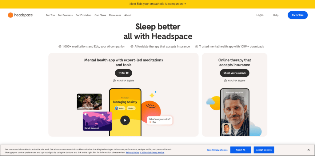
Headspace, the meditation app, uses soft colors, gentle animation, and ample white space to evoke the exact feeling it’s selling: calm. Their headline, “Be kind to your mind,” is warm and benefit-driven. The playful illustration style makes mindfulness feel approachable rather than intimidating.
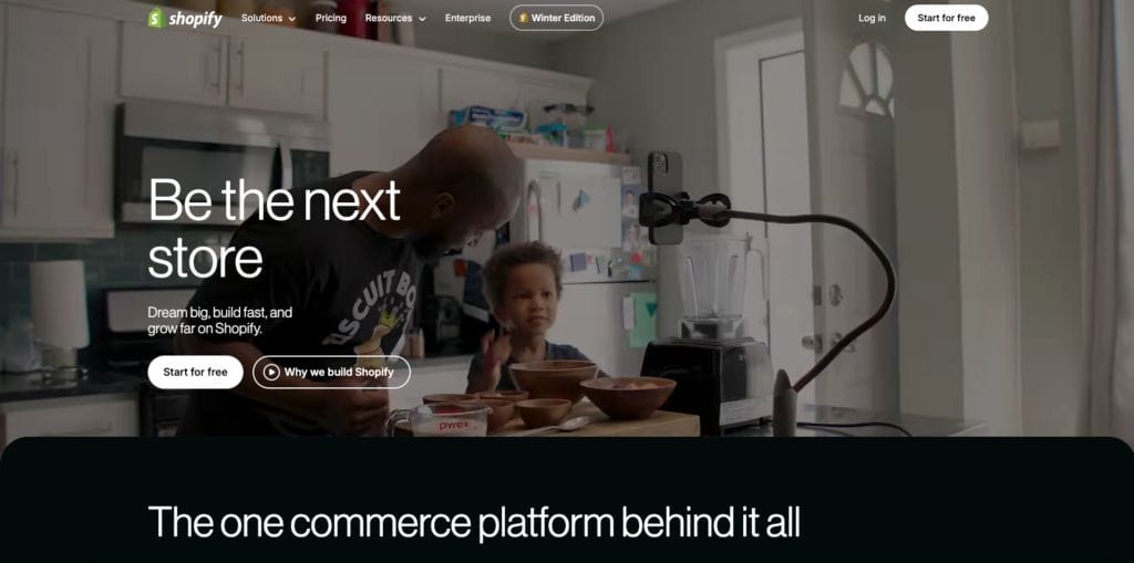
Shopify speaks directly to their audience’s pain point: “Start selling online.” No jargon, no confusion. The hero features a clean product mockup showing their platform in action, with a prominent “Start free trial” button. They immediately follow with trust signals, such as major brand logos, indicating their use of the platform.
What These Examples Have in Common
Each one leads with clarity over cleverness. They know their audience, address a specific need, and use visuals that amplify (not compete with) their message. Most importantly, they provide visitors with a clear path forward.
Design for Movement Without Shouting
Subtle animation, scroll cues, or small interactions can guide visitors deeper into your site. However, restraint is key. The hero’s job isn’t to entertain; it’s to invite. Think of it as a gentle wave hello rather than a fireworks display.
Hero Design Trends for 2026
Here are a few design trends expected to continue in 2026. Each one helps brands create experiences that feel fresh, thoughtful, and delightfully human. For inspiration on bold typography in action, explore award-winning sites on platforms like Awwwards.
Typography: Go Big and Bold
This year is all about confidence in type. Large, expressive fonts instantly capture attention and make your message impossible to miss. Oversized text paired with minimal content feels modern, intentional, and refreshingly direct. Think of it as saying more with less while still saying it beautifully.
Typography: Play with Contrast
Typography should never fade into the background. Strong contrast is key. Choose color combinations that make your words stand out clearly while still feeling harmonious with the rest of your design. The right pairing keeps everything readable and visually crisp.
Imagery: Choose Quality Every Time
Your hero visuals speak before your headline does. Invest in high-resolution images or videos that truly reflect your brand’s story. Blurry or generic visuals can weaken that crucial first impression. Polished imagery, on the other hand, instantly communicates trust and care.
Imagery: Keep the Balance
The best hero sections feel effortless. Avoid crowding the space with excessive copy or numerous design elements. Let your visuals and text share the spotlight in a way that feels natural and cohesive. When everything has breathing room, the whole composition feels lighter, more transparent, and far more inviting.
Interactive Elements
Interactive hero sections are now the norm, adding movement and depth that draw users in and encourage them to explore further.
- Hover Effects: Add subtle animations when users move over buttons, images, or text.
- Parallax Scrolling: Create depth by moving background images at a slower rate than the foreground.
- Micro-Animations: Use small, purposeful movements to guide attention or provide quick feedback.
Thoughtful interaction turns a static hero section into an experience that invites users to stay and explore.
End with Intention: Guide the Next Step
Every strong hero section invites action. Whether it includes a clear “Get Started” button, a simple scroll cue, or an understated arrow, it should point visitors toward what comes next.
A thoughtful call to action turns curiosity into momentum. The goal is to guide visitors forward naturally and provide them with a reason to continue exploring your story without making it feel forced.
Responsive Design is Non-Negotiable
Your hero has to look amazing on every device. The headline should scale gracefully. Images should crop intelligently. Call-to-action buttons should never shrink into oblivion.
Your brand’s first impression travels across screens, so treat it with care on all of them.
Technical Essentials: Responsive Design, Performance & Accessibility
Your hero section needs to work beautifully for everyone, on every device, without compromise.
Responsive Design is Non-Negotiable: Your hero has to look amazing on every screen. Headlines should scale gracefully. Images should crop intelligently. Call-to-action buttons should never shrink into oblivion. Your brand’s first impression travels across devices, so treat it with care on all of them.
For a deeper dive into creating seamless experiences across all devices, explore our guide on responsive design.
Optimize for Speed: A slow-loading hero is a conversion killer. Even a one-second delay can significantly impact bounce rates. Here’s how to keep things fast:
- Compress images without sacrificing quality (use tools like TinyPNG or ImageOptim)
- Use modern image formats like WebP or AVIF
- Implement lazy loading for videos and below-the-fold content
- Host videos externally (YouTube, Vimeo) rather than directly on your server
- Minimize heavy animations that bog down mobile devices
Design for Accessibility: An inclusive hero section works for everyone, including users using screen readers or keyboard navigation:
- Add descriptive alt text to all images
- Ensure text has sufficient color contrast (aim for WCAG AA standards: 4.5:1 for normal text)
- Make CTA buttons keyboard-accessible and clearly labeled
- Avoid text embedded in images and use HTML text overlays instead
- Test with screen readers to ensure your message translates
Accessibility isn’t an afterthought. It’s a design principle that makes your hero stronger for everyone.
How to Know If Your Hero Section is Working
A beautiful hero is only successful if it drives action. Here’s how to measure and improve performance:
Key Metrics to Watch
- Bounce Rate: Are visitors leaving immediately, or are they scrolling to learn more?
- Time on Page: A strong hero keeps users engaged longer
- CTA Click-Through Rate: How many visitors are taking your intended next step?
- Scroll Depth: Are users moving past your hero to explore the rest of your page?
Test and Refine
The best hero sections evolve through testing. Try A/B testing different elements:
- Headline variations (benefit-driven vs. problem-focused)
- CTA button copy (“Get Started” vs. “See How It Works”)
- Visual treatments (image vs. video, light vs. dark backgrounds)
- CTA placement and button colors
Listen to Real Users
Analytics tell part of the story, but user feedback completes it. Run quick five-second tests where users view your hero and tell you what they remember. If they can’t articulate your core message, it’s time to simplify.
The Takeaway
Your hero section design is your front door, your handshake, and your tone in a single frame. When it’s clear, emotional, and crafted with thoughtfulness, it sets the pace for everything that follows.
A strong hero doesn’t happen by accident. It’s the result of intentional choices about messaging, design, performance, and user experience. It respects your visitors’ time, speaks directly to their needs, and guides them forward with confidence.
Make it feel like a place where someone wants to stay for a while.
Ready to Create a Hero Section Design That Converts?
At Perfect Afternoon, we help brands craft digital experiences that feel effortless and perform beautifully. From brand strategy to conversion-focused design, we’re here to make your website work as hard as you do.
Contact us today for a hero section design that converts visitors into customers and transforms your website’s first impression into its most valuable asset.
